css实现渐变色圆角边框
- 渐变色圆角边框(内容区域圆角)
- 渐变色圆角边框(内容区域直角)
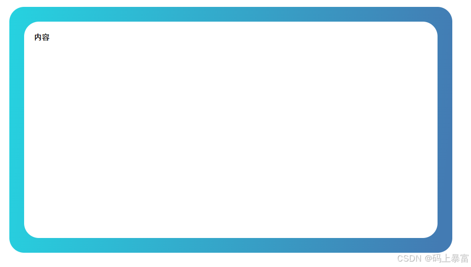
渐变色圆角边框(内容区域圆角)
<!DOCTYPE html>
<html lang="en">
<head><meta charset="UTF-8"><title>渐变色圆角边框(内容区域圆角)</title><style>#container {width: 800px;height: 400px;border-radius: 30px;background-color: white;position: relative;padding: 20px;margin: 50px;}#container::before {content: '';position: absolute;top: -30px;right: -30px;bottom: -30px;left: -30px;border-radius: inherit;background: linear-gradient(96deg, #26d2e0 0%, #437bb3 97%);z-index: -1;}</style>
</head>
<body>
<div id="container">内容</div>
</body>
</html>
渐变色圆角边框(内容区域直角)
<!DOCTYPE html>
<html lang="en">
<head><meta charset="UTF-8"><title>渐变色圆角边框(内容区域直角)</title><style>#container {position: relative;width: 800px;height: 400px;border: 30px solid;border-image: linear-gradient(45deg, #26d2e0, #437bb3) 1;clip-path: inset(0 round 30px);margin: 50px;}</style>
</head>
<body>
<div id="container">内容</div>
</body>
</html>

