一、背景
WPF原生控件提供的API功能不够强大,设置一般的功能都需要进行很复杂的配置和实现。
1.1 原生按钮控件
例如,原生控件<Button/> 默认效果是这样的:
MainWindow.xaml代码:
<Window x:Class="wpf_demo.MainWindow"xmlns="http://schemas.microsoft.com/winfx/2006/xaml/presentation"xmlns:x="http://schemas.microsoft.com/winfx/2006/xaml"xmlns:d="http://schemas.microsoft.com/expression/blend/2008"xmlns:mc="http://schemas.openxmlformats.org/markup-compatibility/2006"xmlns:local="clr-namespace:wpf_demo"mc:Ignorable="d"Title="主页" Height="450" Width="800"><Grid><VirtualizingStackPanel><Button Content="这是一个按钮"/></VirtualizingStackPanel></Grid>
</Window>
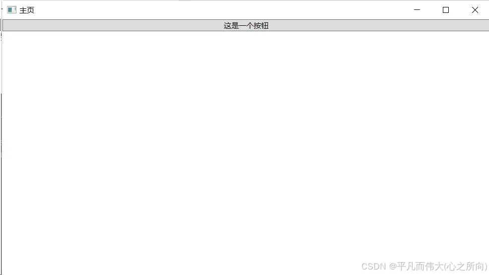
按钮
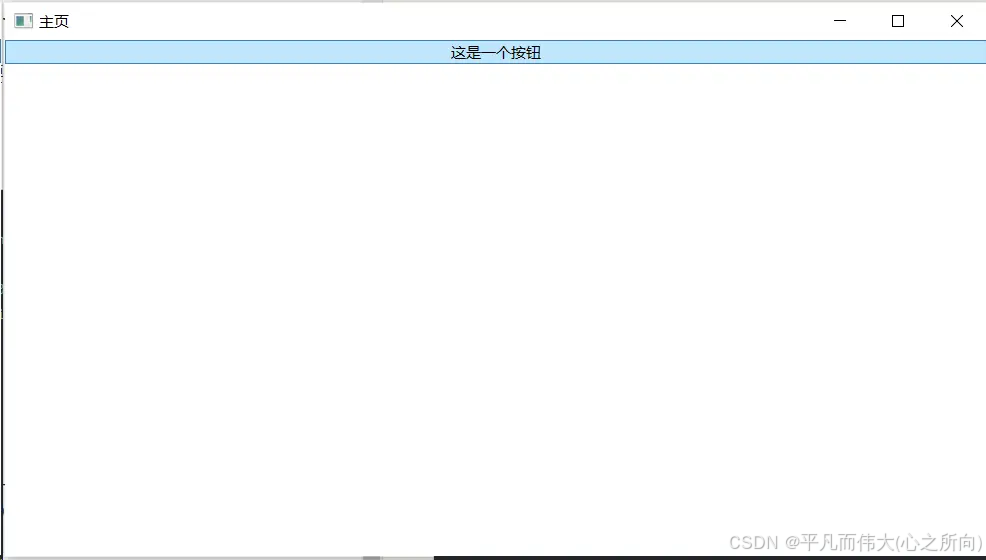
按钮-鼠标悬浮
-
问题1:按钮如果不设置高和宽,宽度默认占满窗口。期望有一个默认的常规的高和宽。
-
问题2:当鼠标悬浮在按钮上时,会默认高亮且颜色为天蓝色。没有提供相关属性来去掉鼠标悬浮效果,且高亮颜色也不能更改。
1.2 自定义按钮控件
为了方便我们自己控制按钮,我们放弃采用原生<Button/> 控件,转而采用<Border/>控件来模拟按钮的效果,但这种实现太过臃肿和复杂。
<Window x:Class="wpf_demo.MainWindow"xmlns="http://schemas.microsoft.com/winfx/2006/xaml/presentation"xmlns:x="http://schemas.microsoft.com/winfx/2006/xaml"xmlns:d="http://schemas.microsoft.com/expression/blend/2008"xmlns:mc="http://schemas.openxmlformats.org/markup-compatibility/2006"xmlns:local="clr-namespace:wpf_demo"mc:Ignorable="d"Title="主页" Height="450" Width="800"><Grid><VirtualizingStackPanel><Border Height="25" Width="100" HorizontalAlignment="Left" BorderBrush="#FFAFAEAE" BorderThickness="1" Background="#FF6BA731"  ><TextBlock MouseLeftButtonUp="ButtonAction" Text="自定义按钮" Foreground="White" TextAlignment="Center" VerticalAlignment="Center"/><Border.Style><Style TargetType="Border"><Style.Triggers><Trigger Property="IsMouseOver" Value="True"><Setter Property="Cursor" Value="Hand" /></Trigger></Style.Triggers></Style></Border.Style></Border></VirtualizingStackPanel></Grid>
</Window>
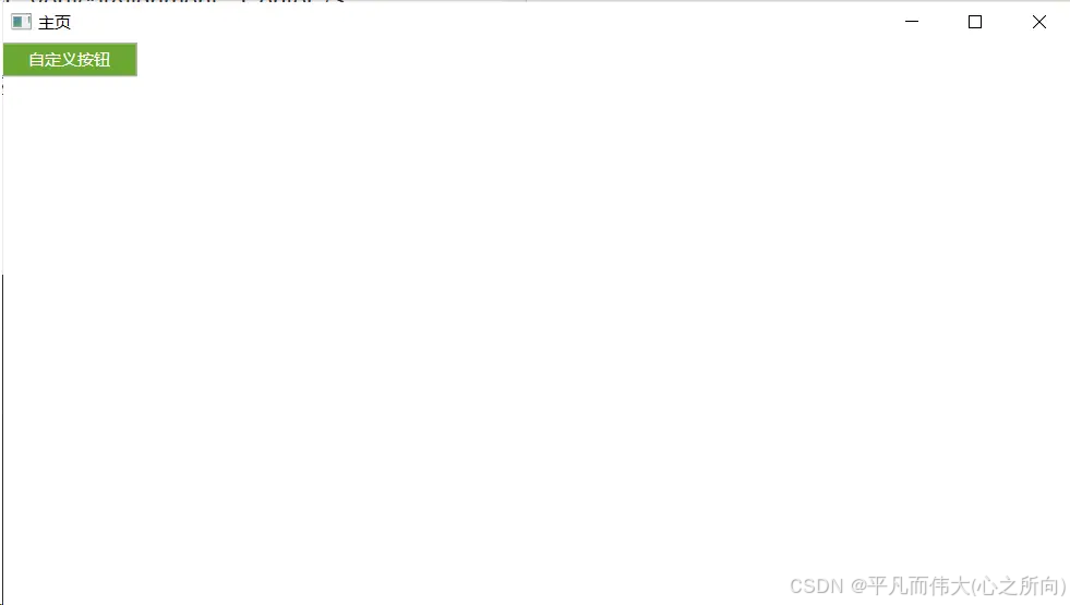
自定义按钮效果
二、解决方案
使用开源框架覆盖原生控件默认的样式,并丰富控件API
三、使用开源框架HandyControl
以下操作步骤,来源于官网文档 HandyControl官网
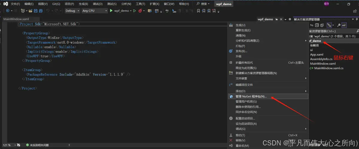
3.1 Nuget的方式引用控件库
Nuget
搜索HandyControl,并进行安装
安装HandyControl
安装成功后,在项目的 【依赖项】-【包】下会显示刚才安装的HandyControl,并有对应的版本号。

安装成功
3.2 在App.xaml中添加以下代码
<Application.Resources><ResourceDictionary><ResourceDictionary.MergedDictionaries><ResourceDictionary Source="pack://application:,,,/HandyControl;component/Themes/SkinDefault.xaml"/><ResourceDictionary Source="pack://application:,,,/HandyControl;component/Themes/Theme.xaml"/></ResourceDictionary.MergedDictionaries></ResourceDictionary>
</Application.Resources>
3.3 在App.xaml中添加命名空间
xmlns:hc="https://handyorg.github.io/handycontrol"
App.xaml完整代码如下:
<Application x:Class="wpf_demo.App"xmlns="http://schemas.microsoft.com/winfx/2006/xaml/presentation"xmlns:x="http://schemas.microsoft.com/winfx/2006/xaml"xmlns:hc="https://handyorg.github.io/handycontrol"xmlns:local="clr-namespace:wpf_demo"StartupUri="MainWindow.xaml"><Application.Resources><ResourceDictionary><ResourceDictionary.MergedDictionaries><ResourceDictionary Source="pack://application:,,,/HandyControl;component/Themes/SkinDefault.xaml"/><ResourceDictionary Source="pack://application:,,,/HandyControl;component/Themes/Theme.xaml"/></ResourceDictionary.MergedDictionaries></ResourceDictionary></Application.Resources>
</Application>
3.4 页面代码
在MainWindow.xaml中添加命名空间
xmlns:controls="clr-namespace:HandyControl.Controls;assembly=HandyControl"
MainWindow.xaml代码:
<Window x:Class="laser.MainWindow"xmlns="http://schemas.microsoft.com/winfx/2006/xaml/presentation"xmlns:x="http://schemas.microsoft.com/winfx/2006/xaml"xmlns:d="http://schemas.microsoft.com/expression/blend/2008"xmlns:mc="http://schemas.openxmlformats.org/markup-compatibility/2006"xmlns:controls="clr-namespace:HandyControl.Controls;assembly=HandyControl"xmlns:local="clr-namespace:laser"mc:Ignorable="d"Title="主页" Height="450" Width="800"><Grid><VirtualizingStackPanel><Button Content="这是一个按钮"/><Button Content="连接" Width="60" Height="25" Margin="0 20 0 0" Background="#FF6BA731" Foreground="White" BorderBrush="#FFAFAEAE" BorderThickness="1" controls:BorderElement.CornerRadius="0"/></VirtualizingStackPanel></Grid>
</Window>
3.5 效果
原来写的原生控件<Button/>代码完全不用动,默认样式就已经被覆盖修改了。效果如下:
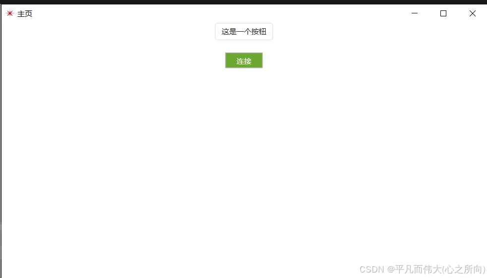
效果
四、HandyControl提示框
4.1 MessageBoxWindow.xaml
<Window x:Class="wpf_demo.MessageBoxWindow"xmlns="http://schemas.microsoft.com/winfx/2006/xaml/presentation"xmlns:x="http://schemas.microsoft.com/winfx/2006/xaml"xmlns:d="http://schemas.microsoft.com/expression/blend/2008"xmlns:mc="http://schemas.openxmlformats.org/markup-compatibility/2006"xmlns:hc="https://handyorg.github.io/handycontrol"xmlns:local="clr-namespace:wpf_demo"mc:Ignorable="d"Title="提示框" Height="450" Width="800"><Grid><VirtualizingStackPanel Orientation="Horizontal" HorizontalAlignment="Center"><Button Width="100" Click="SuccessAction" Height="30" Margin="0 0 10 0">成功</Button><Button Width="100" Click ="FailAction" Height="30">失败</Button></VirtualizingStackPanel></Grid>
</Window>
4.2 MessageBoxWindow.xaml.cs
using System.Windows;
using MessageBox = HandyControl.Controls.MessageBox;namespace wpf_demo
{public partial class MessageBoxWindow : Window{public MessageBoxWindow(){InitializeComponent();}private void SuccessAction(object sender, RoutedEventArgs e){MessageBox.Show("成功", "提示", MessageBoxButton.OK, MessageBoxImage.Information);}private void FailAction(object sender, RoutedEventArgs e){MessageBox.Show("失败", "提示", MessageBoxButton.OK, MessageBoxImage.Error);}}
}
注意,要引入using MessageBox = HandyControl.Controls.MessageBox;,才会覆盖WPF原生提示框效果。
4.3 效果
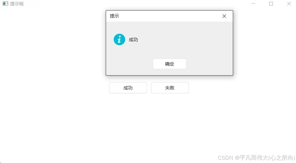
成功
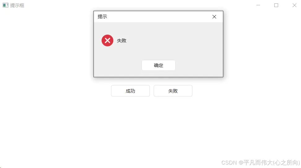
失败
五、国际化问题
5.1 问题描述
在英文系统下,MessageBox弹框按钮依然显示为中文,如下图【确定】按钮显示未中文。
using MessageBox = HandyControl.Controls.MessageBox;MessageBox.Show("Success", "Tip", MessageBoxButton.OK, MessageBoxImage.Information);
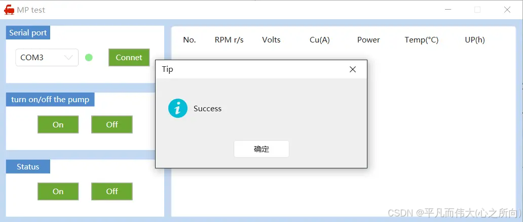
弹框国际化按钮问题
5.2 解决方案
安装英文版HandyControl
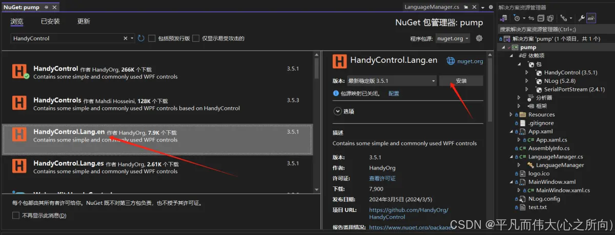
HandyControl英文版
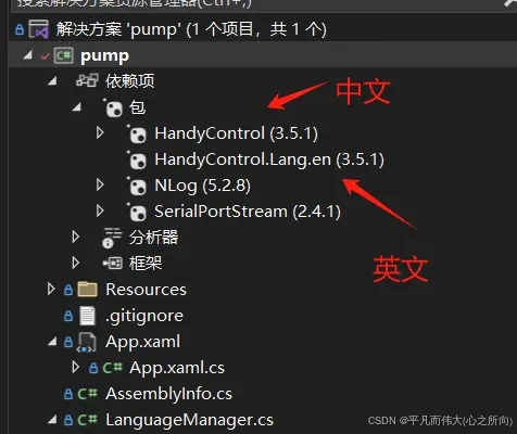
中英文
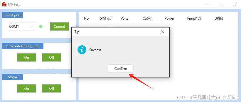
按钮显示英文