目录
代码:
1、 flex-direction
2、flex-wrap
3、justify-content
4、align-items
5、align-content
代码:
<!DOCTYPE html>
<html lang="en">
<head><meta charset="UTF-8"><meta name="viewport" content="width=device-width, initial-scale=1.0"><title>flex弹性布局测试</title><style>.containner{background-color: aqua;display: flex;flex-direction: row;height: 40rem;}.item{width: 40rem;font-size: 4rem;}</style>
</head>
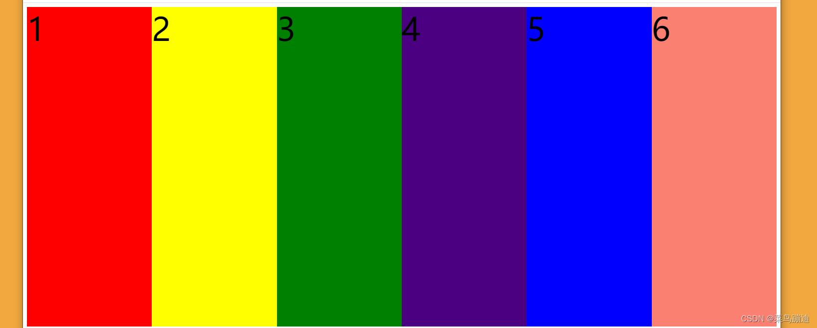
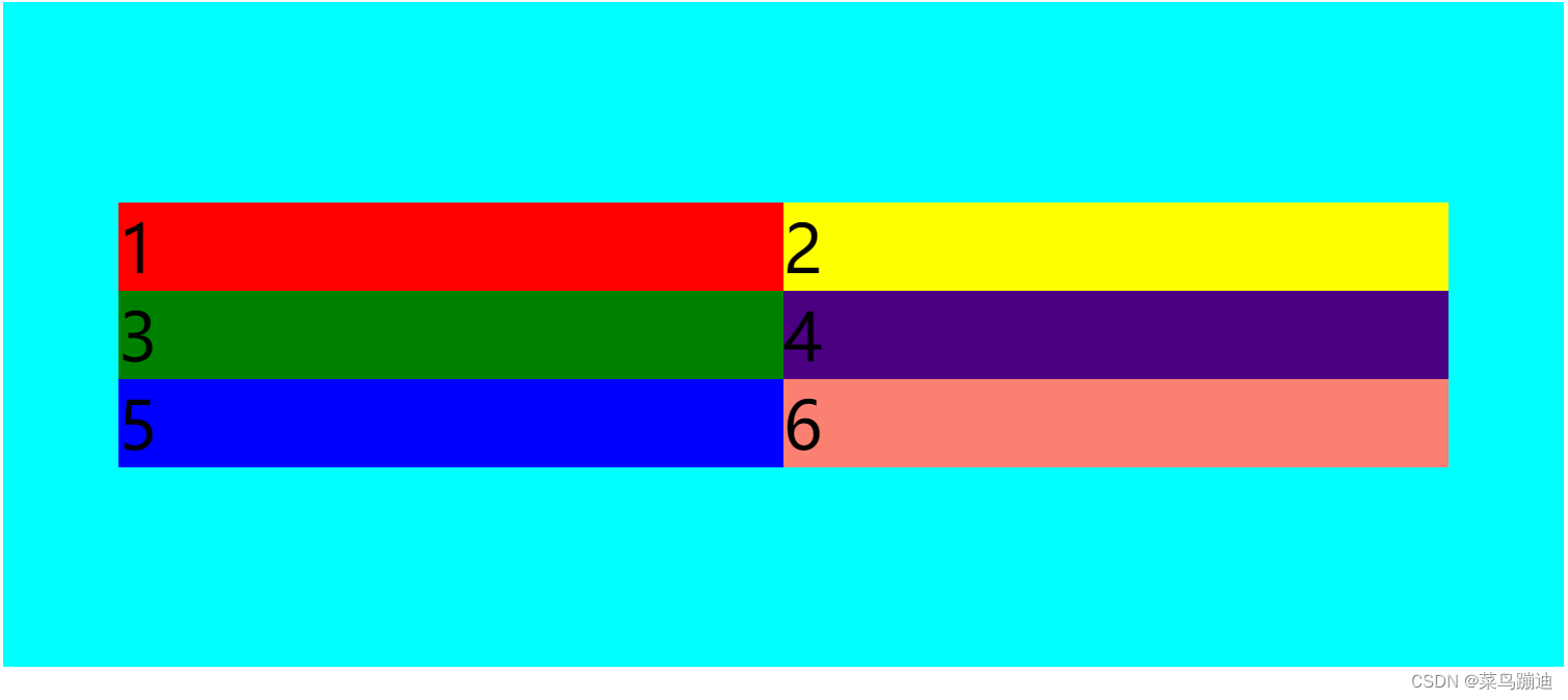
<body><div class="containner"><div class="item" style="background-color: red;">1</div><div class="item" style="background-color: yellow;">2</div><div class="item" style="background-color: green;">3</div><div class="item" style="background-color: indigo;">4</div><div class="item" style="background-color: blue;">5</div><div class="item" style="background-color: salmon;">6</div></div></body>
</html>给item设置一个宽度 原因是默认宽度太小
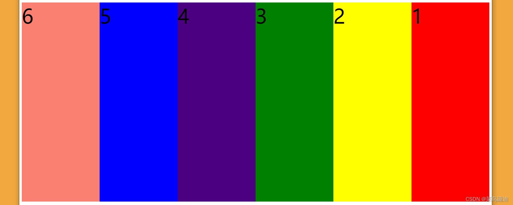
1、 flex-direction
.containner{background-color: aqua;display: flex;flex-direction: row;height: 40rem;}设置轴线:横轴 不轴内逆转
其他属性:
/* 1、设置横轴/纵轴 如果加reverse 就是轴内逆转*//*设置横轴*/flex-direction: row;/* 设置纵轴*//* flex-direction: column;*//* 设置横轴逆转 *//* flex-direction: row-reverse; *//* 设置纵轴逆转 *//* flex-direction: column-reverse; */flex-direction: row-reverse; 横轴逆转
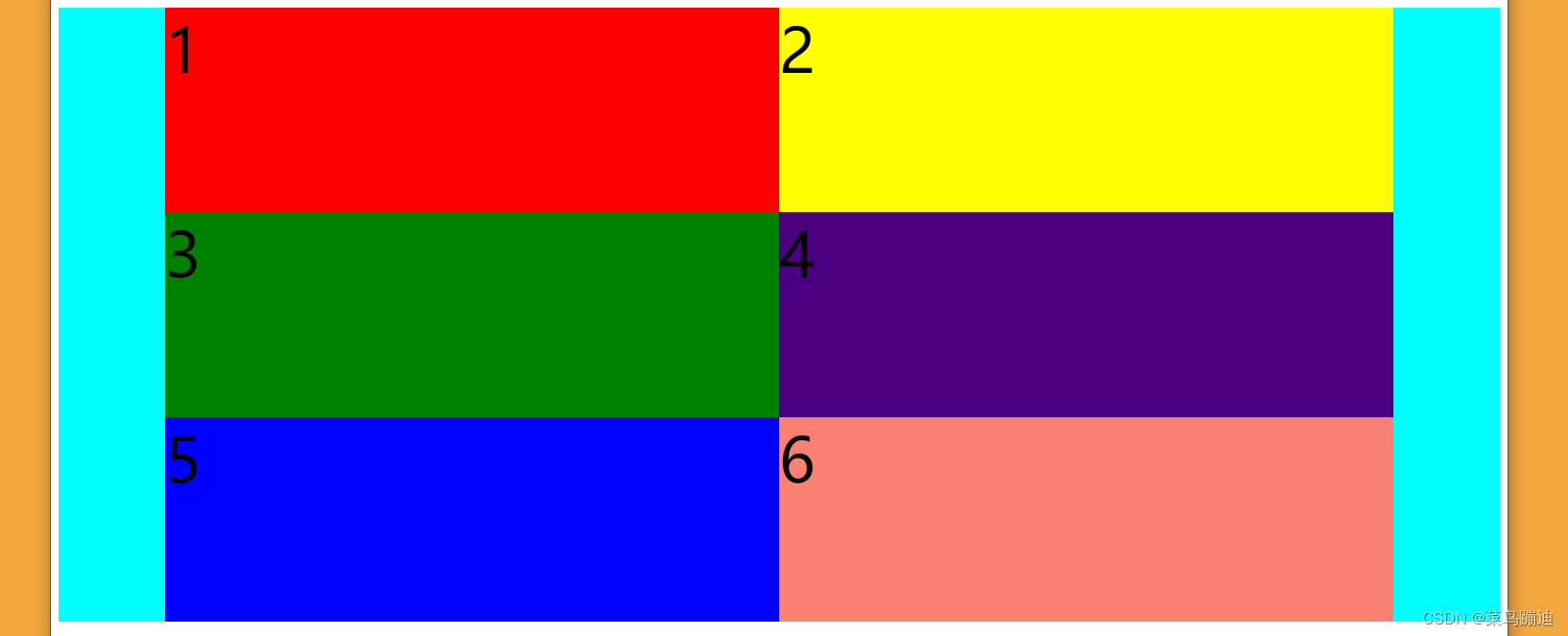
2、flex-wrap
换行/列 是否轴外逆转
.containner{background-color: aqua;display: flex;flex-direction: row-reverse;height: 40rem;flex-wrap: wrap;}换行

其他属性:
/**2、是否换行/列 是否轴外逆转//* flex-wrap: wrap; *//**换行 且纵向逆转*//* flex-wrap: wrap-reverse; */3、justify-content
第一轴如何排列(假设:设置的轴称为第一轴)
.containner{background-color: aqua;display: flex;flex-direction: row;height: 40rem;flex-wrap: wrap;justify-content: center;}中心对称排
其他属性:
/* 3.轴线方向的对称方式 如中心对称 */justify-content: center;/* 起点对其 *//* justify-content: flex-start; *//* 终点对齐*//* justify-content: flex-end; *//* 轴线方向的排列方式 有间隔 *//* 两端中点对齐 两端间隔占0 中间间隔1*//* justify-content: space-between; *//* 区别两边间隔占0.5 中间间隔占1 *//* justify-content: space-around; *//* 所有间隔相等 *//* justify-content: space-evenly; */4、align-items
第二轴是否拉伸以及如何排列 默认是拉伸 /* align-items: stretch; */
保持间距相等
.containner{background-color: aqua;display: flex;flex-direction: row;height: 40rem;flex-wrap: wrap;justify-content: center;align-items: center;}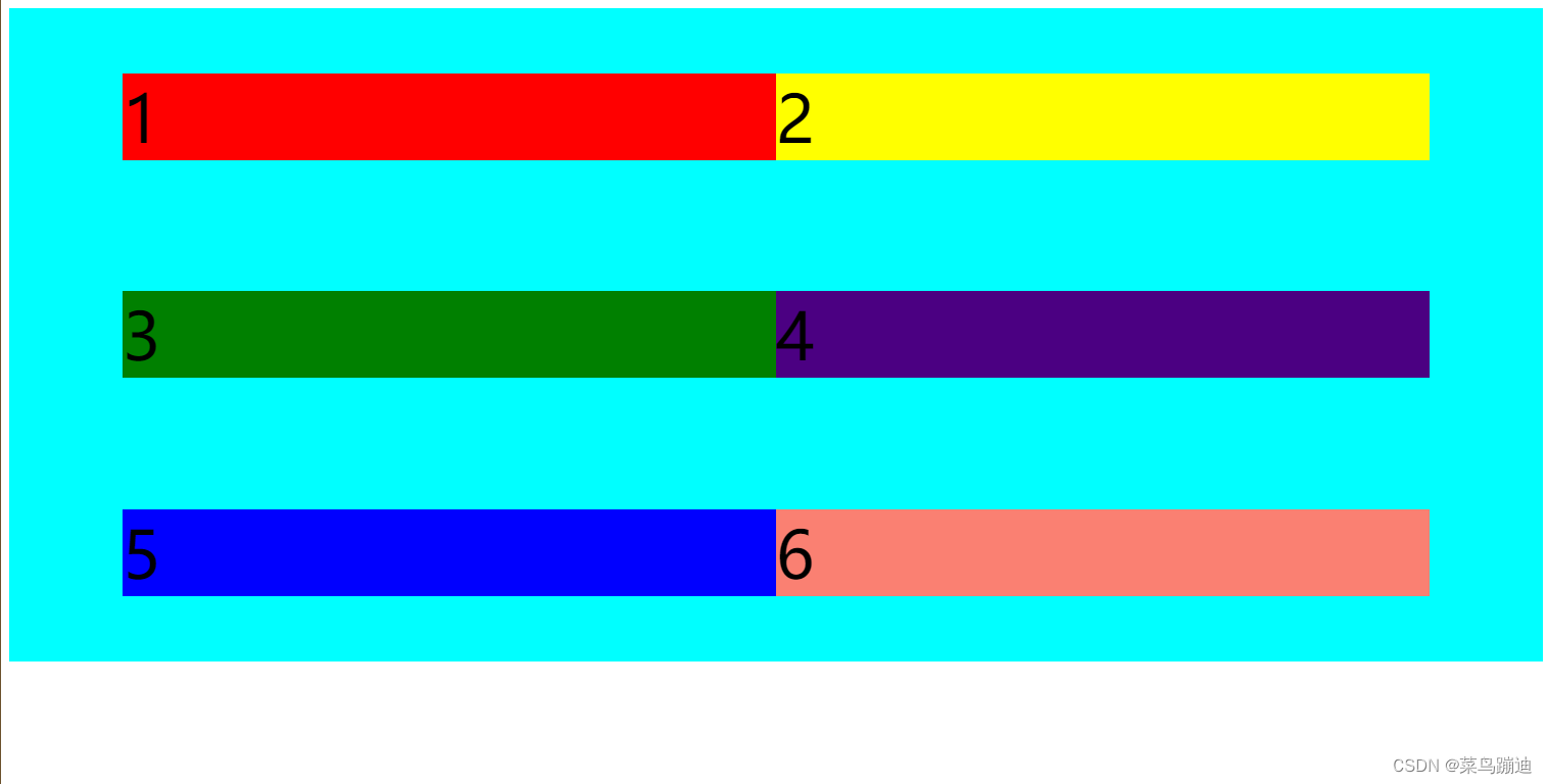
其他属性:
/* 4. 另一方向的对齐方式 默认是拉伸*//* align-items: center; *//* 不拉伸 中间对齐 *//* align-items: stretch; *//* 默认的拉伸 *//* align-items: flex-start; *//* align-items: flex-end; */ps:相当于justify-content中间隔方式
/* justify-content: space-between; */
/* 区别两边间隔占0.5 中间间隔占1 */
/* justify-content: space-around; */
/* 所有间隔相等 */
/* justify-content: space-evenly; */
5、align-content
如何对齐
.containner{background-color: aqua;display: flex;flex-direction: row;height: 40rem;flex-wrap: wrap;justify-content: center;align-items: center;align-content: center;}靠中间对称
其他属性:
/* 5.多个轴线 出现换行时 *//* align-content: center; *//* align-content: flex-start; *//* 纵向不拉伸 */}ps:相当于justify-content中对齐方式
justify-content: center;
/* 起点对其 */
/* justify-content: flex-start; */
/* 终点对齐*/
/* justify-content: flex-end; */