
🌈个人主页:前端青山 🔥系列专栏:React篇
🔖人终将被年少不可得之物困其一生
依旧青山,本期给大家带来React篇专栏内容:react后台管理系统(一)
前言
本文档详细介绍了如何从零开始搭建一个基于 React 和 Ant Design 的前端项目。通过逐步引导,读者可以了解从项目初始化到配置装饰器、集成 UI 库、设计布局结构、配置路由以及实现左侧菜单栏的完整流程。本文档适合初学者和有一定经验的开发者,帮助他们在实际项目中快速上手。
目录
前言
1.创建项目
2.配置装饰器(但不是必须)
3.配置UI库
4.修改目录结构
5.搭建项目的主结构
6.设计左侧菜单栏
7.左侧菜单
总结
1.创建项目
npx create-react-app react-pro- 1.
2.配置装饰器(但不是必须)
安装模块
cnpm i @babel/plugin-proposal-decorators customize-cra react-app-rewired -D
yarn add @babel/plugin-proposal-decorators customize-cra react-app-rewired -D- 1.
- 2.
根目录下创建config-overrides.js
// 参考配置连接:https://www.npmjs.com/package/customize-cra
const {override,addDecoratorsLegacy}=require("customize-cra");module.exports=override(addDecoratorsLegacy(),//配置装饰器模式
);- 1.
- 2.
- 3.
- 4.
- 5.
- 6.
修改package.json运行命令
...,
"scripts": {"start": "react-app-rewired start", // update"build": "react-app-rewired build", // update"test": "react-app-rewired test",  // update"eject": "react-scripts eject"
},
...
import { connect } from 'react-redux'
class App extends Component {render () {return ()}
}
export default connect(mapStateToProps, mapDispatchToProps)(App)==装饰器(只能用在类组件中,可以装饰类以及类的方法)==>
import { connect } from 'react-redux'@connect(mapStateToProps, mapDispatchToProps)
class App extends Component {render () {return ()}
}export default App- 1.
- 2.
- 3.
- 4.
- 5.
- 6.
- 7.
- 8.
- 9.
- 10.
- 11.
- 12.
- 13.
- 14.
- 15.
- 16.
- 17.
- 18.
- 19.
- 20.
- 21.
- 22.
- 23.
- 24.
- 25.
- 26.
- 27.
3.配置UI库
Ant Design - 一套企业级 UI 设计语言和 React 组件库 查看文档
在 create-react-app 中使用 - Ant Design 查看具体的使用文档
cnpm i antd -S
yarn add antd -S- 1.
- 2.
删除src文件内容,添加index.css 以及 index.js
index.css
@import '~antd/dist/antd.css';- 1.
index.js
import React from 'react'
import ReactDOM from 'react-dom'import App from './App'
import './index.css'
ReactDOM.render(<App />,document.querySelector('#root')
)- 1.
- 2.
- 3.
- 4.
- 5.
- 6.
- 7.
- 8.
- 9.
测试UI库 App.jsx
import React from 'react'
import { Button } from 'antd'
const App = () => {return (<><Button  type="primary">hello</Button></>)
}export default App- 1.
- 2.
- 3.
- 4.
- 5.
- 6.
- 7.
- 8.
- 9.
- 10.
- 11.
4.修改目录结构
srcapicomponentslayoutrouterstoreutilsviews- 1.
- 2.
- 3.
- 4.
- 5.
- 6.
- 7.
- 8.
5.搭建项目的主结构
查看Layout 组件,修改App.jsx
import React from 'react'
import { Layout, Menu } from 'antd';
import {MenuUnfoldOutlined,MenuFoldOutlined,UserOutlined,VideoCameraOutlined,UploadOutlined,
} from '@ant-design/icons';const { Header, Sider, Content } = Layout;class App extends React.Component {state = {collapsed: false,};toggle = () => {this.setState({collapsed: !this.state.collapsed,});};render() {return (<Layout><Sider className="mySider" trigger={null} collapsible collapsed={this.state.collapsed}><div className="logo" /><Menu theme="dark" mode="inline" defaultSelectedKeys={['1']}><Menu.Item key="1" icon={<UserOutlined />}>nav 1</Menu.Item><Menu.Item key="2" icon={<VideoCameraOutlined />}>nav 2</Menu.Item><Menu.Item key="3" icon={<UploadOutlined />}>nav 3</Menu.Item></Menu></Sider><Layout className="site-layout"><Header className="site-layout-background" style={{ padding: 0 }}>{React.createElement(this.state.collapsed ? MenuUnfoldOutlined : MenuFoldOutlined, {className: 'trigger',onClick: this.toggle,})}</Header><ContentclassName="site-layout-background"style={{margin: '24px 16px',padding: 24,minHeight: 280,}}>Content</Content></Layout></Layout>);}
}export default App- 1.
- 2.
- 3.
- 4.
- 5.
- 6.
- 7.
- 8.
- 9.
- 10.
- 11.
- 12.
- 13.
- 14.
- 15.
- 16.
- 17.
- 18.
- 19.
- 20.
- 21.
- 22.
- 23.
- 24.
- 25.
- 26.
- 27.
- 28.
- 29.
- 30.
- 31.
- 32.
- 33.
- 34.
- 35.
- 36.
- 37.
- 38.
- 39.
- 40.
- 41.
- 42.
- 43.
- 44.
- 45.
- 46.
- 47.
- 48.
- 49.
- 50.
- 51.
- 52.
- 53.
- 54.
- 55.
- 56.
- 57.
- 58.
- 59.
- 60.
- 61.
- 62.
- 63.
- 64.
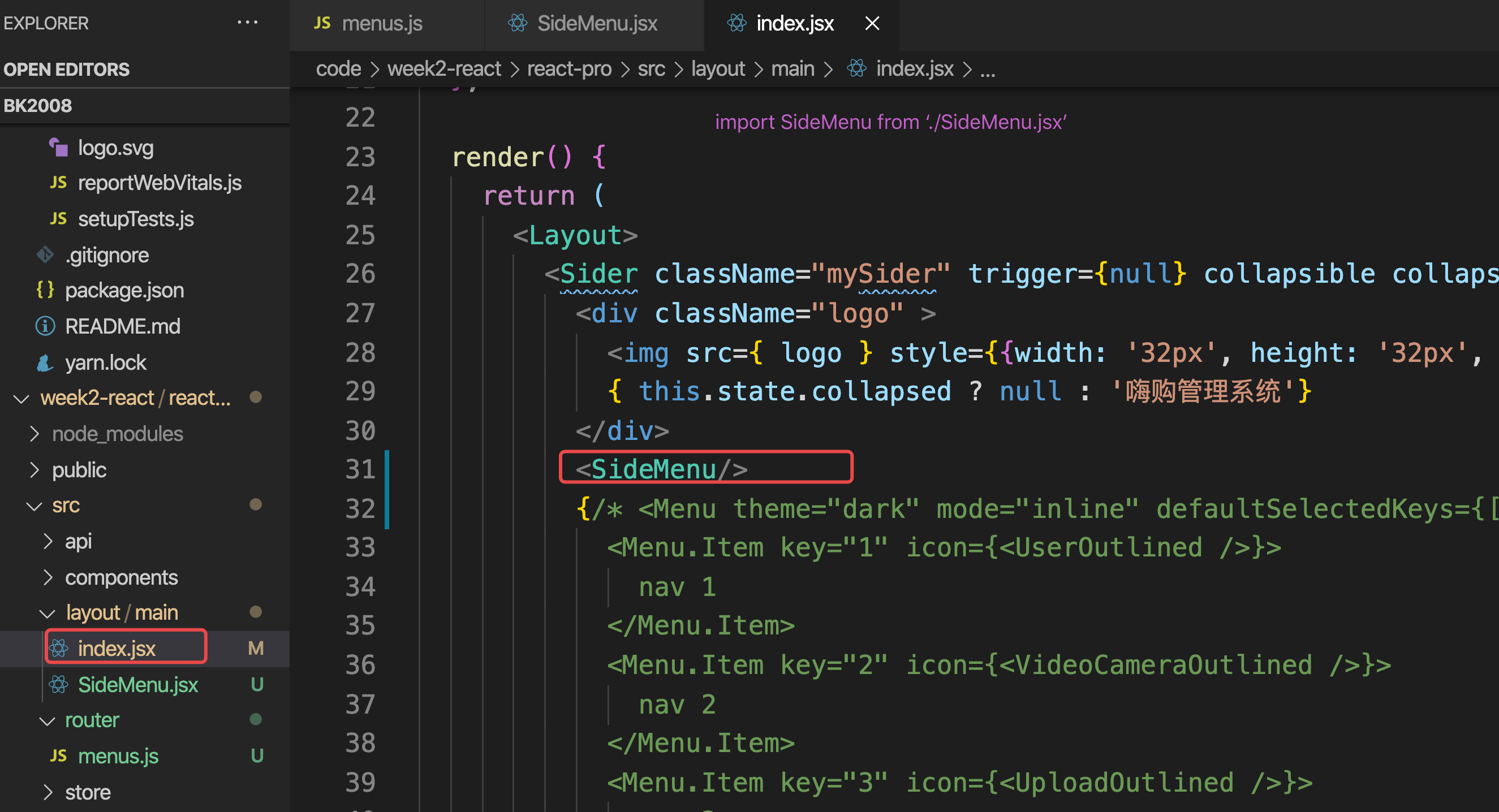
添加logo,
import logo from './logo.svg'<Sider trigger={null} collapsible collapsed={this.state.collapsed}>// ++++++++<div className="logo"><img src={ logo } style={{width: '32px', height: '32px', margin: '0 10px 0 0'}} alt=""/>{ this.state.collapsed ? null : '嗨购管理系统' }</div>// ++++++++<Menu theme="dark" mode="inline" defaultSelectedKeys={['1']}><Menu.Item key="1" icon={<UserOutlined />}>nav 1</Menu.Item><Menu.Item key="2" icon={<VideoCameraOutlined />}>nav 2</Menu.Item><Menu.Item key="3" icon={<UploadOutlined />}>nav 3</Menu.Item></Menu>
</Sider>- 1.
- 2.
- 3.
- 4.
- 5.
- 6.
- 7.
- 8.
- 9.
- 10.
- 11.
- 12.
- 13.
- 14.
- 15.
- 16.
- 17.
- 18.
- 19.
- 20.
- 21.
- 22.
相关样式 index.css
@import '~antd/dist/antd.css';
#root { height: 100%;}
.ant-layout { height: 100%;}
.mySider .trigger {padding: 0 24px;font-size: 18px;line-height: 64px;cursor: pointer;transition: color 0.3s;
}.mySider .trigger:hover {color: #1890ff;
}.mySider .logo {height: 32px;margin: 16px;/* background: rgba(255, 255, 255, 0.3); */color: #fff;font-size: 18px;line-height: 32px;
}.site-layout .site-layout-background {background: #fff;
}- 1.
- 2.
- 3.
- 4.
- 5.
- 6.
- 7.
- 8.
- 9.
- 10.
- 11.
- 12.
- 13.
- 14.
- 15.
- 16.
- 17.
- 18.
- 19.
- 20.
- 21.
- 22.
- 23.
- 24.
- 25.
- 26.
- 27.
移植App.jsx代码至 layout/main/index.jsx,注意logo的路径
Logo.svg图片在src目录下
import logo from '../../logo.svg'- 1.
安装路由模块
yarn add react-router-dom -S- 1.
修改App.jsx
import React from 'react'
import { BrowserRouter as Router, Switch, Route } from 'react-router-dom'
import Main from './layout/main/index.jsx'
function App () {return (<Router ><Switch><Route path="/" component = {Main}/></Switch></Router>)
}export default App- 1.
- 2.
- 3.
- 4.
- 5.
- 6.
- 7.
- 8.
- 9.
- 10.
- 11.
- 12.
- 13.
- 14.
6.设计左侧菜单栏
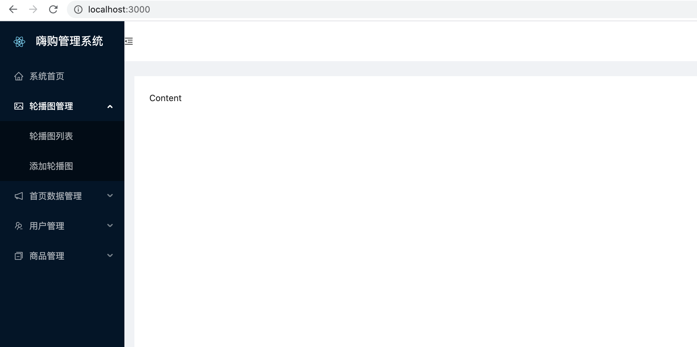
https://gp.adouzaizai.top/haigou/#/login
7.左侧菜单
按照UI库 的 Menu组件以及 Tree树形控件。设计字段
生成左侧菜单的基本配置信息 router/menus.js
import { HomeOutlined,PictureOutlined,NotificationOutlined,UsergroupDeleteOutlined,SwitcherOutlined
} from '@ant-design/icons'
const menus = [{title: '系统首页',path: '/home',key: '0-0',icon: <HomeOutlined />},{title: '轮播图管理',path: '/banner',key: '0-1',icon: <PictureOutlined />,children: [{title: '轮播图列表',path: '/banner/list',key: '0-1-0'},{title: '添加轮播图',path: '/banner/add',key: '0-1-1'},]},{title: '首页数据管理',path: '/homeData',key: '0-2',icon: <NotificationOutlined />,children: [{title: '秒杀列表',path: '/homeData/skill',key: '0-2-0',},{title: '推荐列表',path: '/homeData/recommend',key: '0-2-1',}]},{title: '用户管理',path: '/users',key: '0-3',icon: <UsergroupDeleteOutlined />,children: [{title: '用户列表',path: '/users/list',key: '0-3-0',},{title: '管理员列表',path: '/users/adminList',key: '0-3-1',}]},{title: '商品管理',path: '/pro',key: '0-4',icon: <SwitcherOutlined />,children: [{title: '商品列表',path: '/pro/list',key: '0-4-0',},{title: '筛选商品',path: '/pro/search',key: '0-4-1',}]}
]
export default menus- 1.
- 2.
- 3.
- 4.
- 5.
- 6.
- 7.
- 8.
- 9.
- 10.
- 11.
- 12.
- 13.
- 14.
- 15.
- 16.
- 17.
- 18.
- 19.
- 20.
- 21.
- 22.
- 23.
- 24.
- 25.
- 26.
- 27.
- 28.
- 29.
- 30.
- 31.
- 32.
- 33.
- 34.
- 35.
- 36.
- 37.
- 38.
- 39.
- 40.
- 41.
- 42.
- 43.
- 44.
- 45.
- 46.
- 47.
- 48.
- 49.
- 50.
- 51.
- 52.
- 53.
- 54.
- 55.
- 56.
- 57.
- 58.
- 59.
- 60.
- 61.
- 62.
- 63.
- 64.
- 65.
- 66.
- 67.
- 68.
- 69.
- 70.
- 71.
- 72.
- 73.
- 74.
- 75.
- 76.
- 77.
- 78.
- 79.
- 80.
- 81.
- 82.
- 83.
- 84.
- 85.
- 86.
- 87.
- 88.
配置左侧菜单栏(抽离左侧菜单栏组件/layout/main/SideMenu.jsx)
挑选UI库中 Menus 菜单,选择 只展开当前父级菜单
import React from 'react'
import { Menu } from 'antd';
import { AppstoreOutlined, MailOutlined, SettingOutlined } from '@ant-design/icons';const { SubMenu } = Menu;// submenu keys of first level
const rootSubmenuKeys = ['sub1', 'sub2', 'sub4'];const SideMenu = () => {const [openKeys, setOpenKeys] = React.useState(['sub1']);const onOpenChange = keys => {const latestOpenKey = keys.find(key => openKeys.indexOf(key) === -1);if (rootSubmenuKeys.indexOf(latestOpenKey) === -1) {setOpenKeys(keys);} else {setOpenKeys(latestOpenKey ? [latestOpenKey] : []);}};return (<Menu mode="inline" openKeys={openKeys} onOpenChange={onOpenChange} style={{ width: 256 }}><SubMenu key="sub1" icon={<MailOutlined />} title="Navigation One"><Menu.Item key="1">Option 1</Menu.Item><Menu.Item key="2">Option 2</Menu.Item><Menu.Item key="3">Option 3</Menu.Item><Menu.Item key="4">Option 4</Menu.Item></SubMenu><SubMenu key="sub2" icon={<AppstoreOutlined />} title="Navigation Two"><Menu.Item key="5">Option 5</Menu.Item><Menu.Item key="6">Option 6</Menu.Item><SubMenu key="sub3" title="Submenu"><Menu.Item key="7">Option 7</Menu.Item><Menu.Item key="8">Option 8</Menu.Item></SubMenu></SubMenu><SubMenu key="sub4" icon={<SettingOutlined />} title="Navigation Three"><Menu.Item key="9">Option 9</Menu.Item><Menu.Item key="10">Option 10</Menu.Item><Menu.Item key="11">Option 11</Menu.Item><Menu.Item key="12">Option 12</Menu.Item></SubMenu></Menu>);
};export default SideMenu- 1.
- 2.
- 3.
- 4.
- 5.
- 6.
- 7.
- 8.
- 9.
- 10.
- 11.
- 12.
- 13.
- 14.
- 15.
- 16.
- 17.
- 18.
- 19.
- 20.
- 21.
- 22.
- 23.
- 24.
- 25.
- 26.
- 27.
- 28.
- 29.
- 30.
- 31.
- 32.
- 33.
- 34.
- 35.
- 36.
- 37.
- 38.
- 39.
- 40.
- 41.
- 42.
- 43.
- 44.
- 45.
- 46.
- 47.
- 48.
主界面 调用该组件,
修改菜单栏组件以及渲染正确的菜单栏数据
import React from 'react'
import { Menu } from 'antd';
import menus from '../../router/menus'
const { SubMenu } = Menu;// submenu keys of first level
const rootSubmenuKeys = ['sub1', 'sub2', 'sub4'];const SideMenu = () => {const [openKeys, setOpenKeys] = React.useState(['sub1']);const onOpenChange = keys => {const latestOpenKey = keys.find(key => openKeys.indexOf(key) === -1);if (rootSubmenuKeys.indexOf(latestOpenKey) === -1) {setOpenKeys(keys);} else {setOpenKeys(latestOpenKey ? [latestOpenKey] : []);}};const renderMenus = (menus) => {return menus.map(item => {// 判断当前的选项有没有子菜单if (item.children) { // 有子级菜单return (<SubMenu key={ item.path } icon={ item.icon } title={item.title}>{/* 递归调用自身,渲染多级菜单 */}{ renderMenus(item.children) }</SubMenu>)} else {// path具有唯一性,key也具有唯一性// 为了后续操作方便,此时建议将path作为遍历的key值return <Menu.Item key={ item.path } icon = { item.icon }>{ item.title }</Menu.Item>}})}return (<Menu theme="dark" mode="inline" openKeys={openKeys} onOpenChange={onOpenChange} >{renderMenus(menus)}{/* <Menu.Item key="1">Option 1</Menu.Item><SubMenu key="sub1" icon={<MailOutlined />} title="Navigation One"><Menu.Item key="1">Option 1</Menu.Item><Menu.Item key="2">Option 2</Menu.Item><Menu.Item key="3">Option 3</Menu.Item><Menu.Item key="4">Option 4</Menu.Item></SubMenu> */}</Menu>);
};export default SideMenu- 1.
- 2.
- 3.
- 4.
- 5.
- 6.
- 7.
- 8.
- 9.
- 10.
- 11.
- 12.
- 13.
- 14.
- 15.
- 16.
- 17.
- 18.
- 19.
- 20.
- 21.
- 22.
- 23.
- 24.
- 25.
- 26.
- 27.
- 28.
- 29.
- 30.
- 31.
- 32.
- 33.
- 34.
- 35.
- 36.
- 37.
- 38.
- 39.
- 40.
- 41.
- 42.
- 43.
- 44.
- 45.
- 46.
- 47.
- 48.
- 49.
- 50.
- 51.
- 52.
- 53.
- 54.
- 55.
浏览器测试发现并么有只展开一项,点击之后全部可以展开
import React from 'react'
import { Menu } from 'antd';
import menus from '../../router/menus'
const { SubMenu } = Menu;// submenu keys of first level
const keyArr = []
menus.forEach(item => { // 只需要一级菜单项即可keyArr.push(item.path)
})
// const rootSubmenuKeys = ['sub1', 'sub2', 'sub4'];
const rootSubmenuKeys = keyArrconst SideMenu = () => {const [openKeys, setOpenKeys] = React.useState([]);const onOpenChange = keys => {const latestOpenKey = keys.find(key => openKeys.indexOf(key) === -1);if (rootSubmenuKeys.indexOf(latestOpenKey) === -1) {setOpenKeys(keys);} else {setOpenKeys(latestOpenKey ? [latestOpenKey] : []);}};const renderMenus = (menus) => {return menus.map(item => {// 判断当前的选项有没有子菜单if (item.children) { // 有子级菜单return (<SubMenu key={ item.path } icon={ item.icon } title={item.title}>{/* 递归调用自身,渲染多级菜单 */}{ renderMenus(item.children) }</SubMenu>)} else {// path具有唯一性,key也具有唯一性// 为了后续操作方便,此时建议将path作为遍历的key值return <Menu.Item key={ item.path } icon = { item.icon }>{ item.title }</Menu.Item>}})}return (<Menu theme="dark" mode="inline" openKeys={openKeys} onOpenChange={onOpenChange} >{renderMenus(menus)}{/* <Menu.Item key="1">Option 1</Menu.Item><SubMenu key="sub1" icon={<MailOutlined />} title="Navigation One"><Menu.Item key="1">Option 1</Menu.Item><Menu.Item key="2">Option 2</Menu.Item><Menu.Item key="3">Option 3</Menu.Item><Menu.Item key="4">Option 4</Menu.Item></SubMenu> */}</Menu>);
};export default SideMenu- 1.
- 2.
- 3.
- 4.
- 5.
- 6.
- 7.
- 8.
- 9.
- 10.
- 11.
- 12.
- 13.
- 14.
- 15.
- 16.
- 17.
- 18.
- 19.
- 20.
- 21.
- 22.
- 23.
- 24.
- 25.
- 26.
- 27.
- 28.
- 29.
- 30.
- 31.
- 32.
- 33.
- 34.
- 35.
- 36.
- 37.
- 38.
- 39.
- 40.
- 41.
- 42.
- 43.
- 44.
- 45.
- 46.
- 47.
- 48.
- 49.
- 50.
- 51.
- 52.
- 53.
- 54.
- 55.
- 56.
- 57.
- 58.
- 59.
- 60.
总结
通过本文档,我们完成了以下主要步骤:
- 创建项目:使用
create-react-app快速初始化项目。 - 配置装饰器:安装必要的依赖并配置 Babel 插件,支持类组件的装饰器语法。
- 配置 UI 库:引入 Ant Design 并进行基本配置,确保项目中可以正常使用 Ant Design 的组件。
- 修改目录结构:整理项目目录,使其更加符合实际开发需求。
- 搭建主结构:设计并实现项目的主布局,包括顶部导航和侧边栏。
- 配置路由:安装并配置
react-router-dom,实现页面之间的导航。 - 设计左侧菜单栏:使用 Ant Design 的
Menu组件,实现动态生成的多级菜单,并确保只展开当前选中的父级菜单。
通过以上步骤,我们成功搭建了一个功能完善、结构清晰的 React 项目。希望本文档能为读者在实际开发中提供有价值的参考。