研究背景
人的心脏有四个瓣膜,主动脉银、二尖、肺动脉和三尖源 不管是那一个膜发生了病变,都会导致心脏内的血流受到影响,这就是通常所说的心脏期膜病,很多是需要通过手术的方式进行改善的。随着人口老龄化的加剧,,心脏期膜病是我国最常见的心血管疾病之-,需要接受心脏瓣膜手术治疗的患者数量逐年拳升。心脏期膜手术是对病变的心脏辨膜所进行的外科手术,一般包括心脏期的置换和修复手术,心期手术是在外科技术的基础上,对病变的心脏期膜所进行的手术,可以改善患者心脏期聘狭窄或关闭不全的现象。不过心脏瓣膜病手术可能会引发机械瓣并发症,导致心功能变差,严重的还会直接造成患者死亡。
实验分析
首先导入基本的数据分析包
# import data handling libsimport pandas as pd
import numpy as np
import matplotlib.pyplot as plt
import seaborn as sns# import modelsfrom sklearn.linear_model import LinearRegression, LogisticRegression
from sklearn.svm  import SVC
from sklearn.neighbors import KNeighborsClassifier
from sklearn.metrics import confusion_matrix, classification_report, accuracy_score
from sklearn.model_selection import train_test_split
from sklearn.tree import DecisionTreeClassifier
from sklearn.ensemble import RandomForestClassifierimport warnings
warnings.filterwarnings('ignore')
读取数据
# Importing datasetdf = pd.read_csv('dataset.csv')展示数据集和结构
df.head()
rows, columns = df.shapeprint(f"Number Of Rows : {rows}")
print(f"Number Of Columns : {columns}") 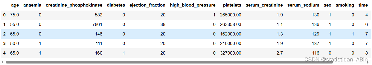
![]()
数据集特征结构
df.info()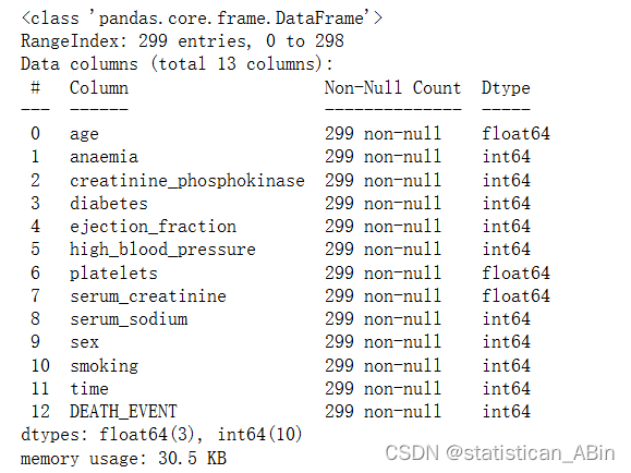
描述性分析
df.describe()
查看每列的唯一值的数量
df.nunique()查看下相关系数并且画出热力图
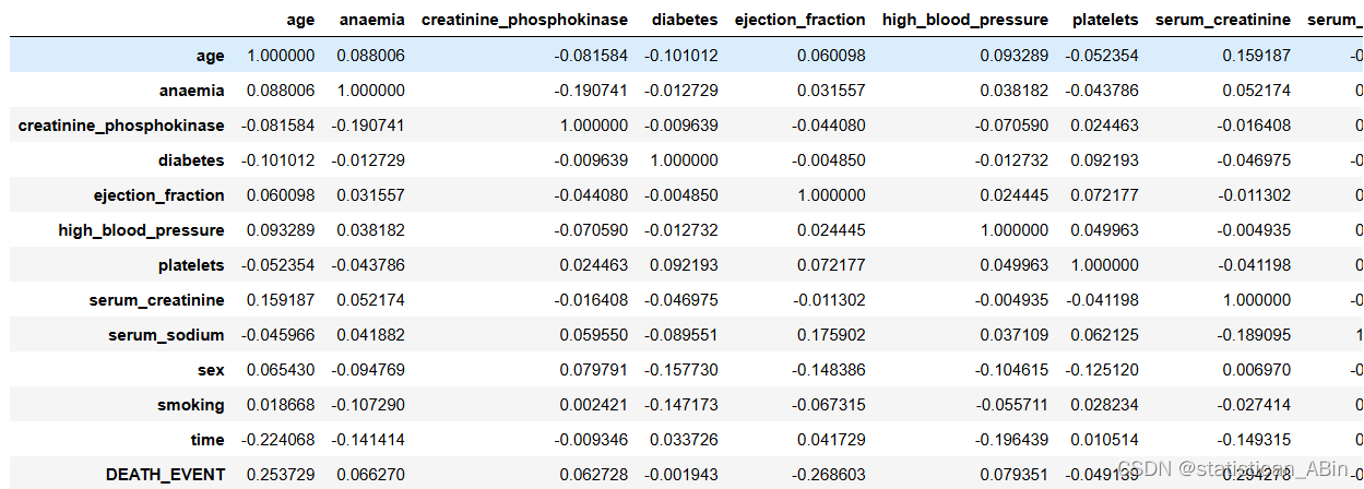
plt.figure(figsize=(10, 8))
corr = df.corr()
sns.heatmap(corr, annot=True, cmap='Blues')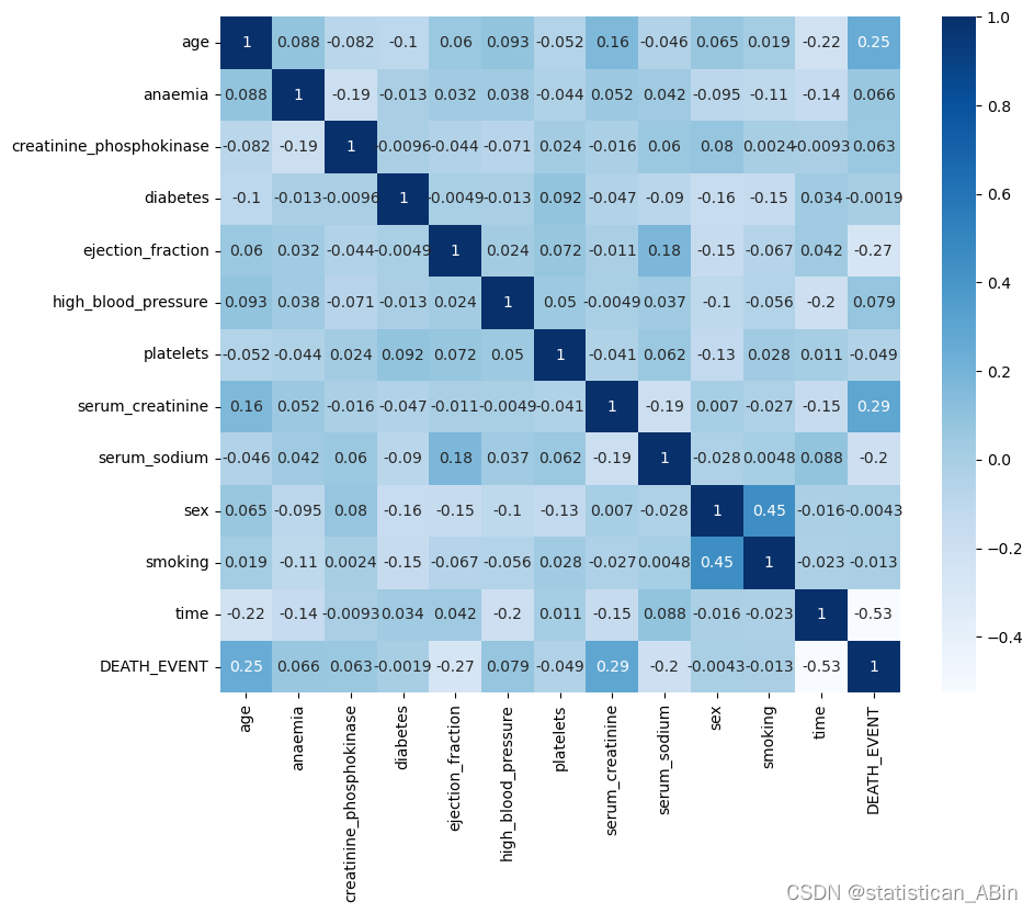
查看缺失值
df.isnull().sum()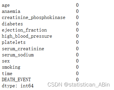
接下来进行特征选择
plt.rcParams['figure.figsize']=15,6
sns.set_style("darkgrid")x = df.iloc[:, :-1]
y = df.iloc[:,-1]from sklearn.ensemble import ExtraTreesClassifier
import matplotlib.pyplot as plt
model = ExtraTreesClassifier()
model.fit(x,y)
print(model.feature_importances_)
feat_importances = pd.Series(model.feature_importances_, index=x.columns)
feat_importances.nlargest(12).plot(kind='barh', color='teal')
plt.show()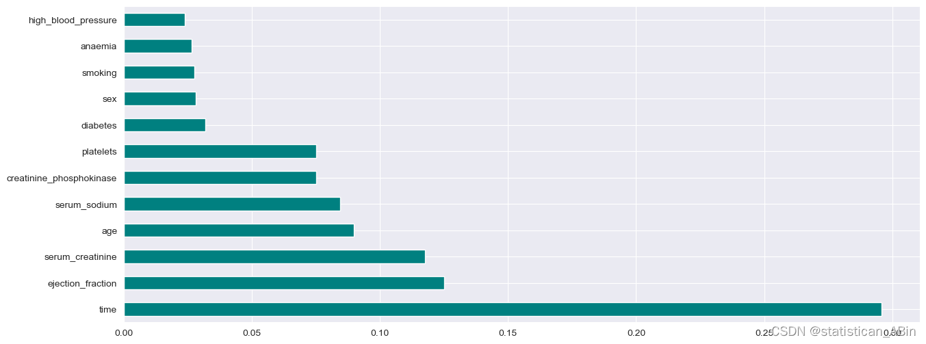
检查一下离群值
sns.boxplot(x = df.ejection_fraction, color='teal')
plt.show() 
可以发现有两个离群值
接下来对特征进行可视化
# Distribution of Ageimport plotly.graph_objects as gofig = go.Figure()
fig.add_trace(go.Histogram(x = df['age'],xbins=dict( # bins used for histogramstart=40,end=95,size=2),marker_color='#e8ab60',opacity=1
))fig.update_layout(title_text='AGE DISTRIBUTION',xaxis_title_text='AGE',yaxis_title_text='COUNT', bargap=0.05, # gap between bars of adjacent location coordinatesxaxis =  {'showgrid': False },yaxis = {'showgrid': False },template = 'plotly_dark'
)fig.show()
plt.style.use("seaborn")
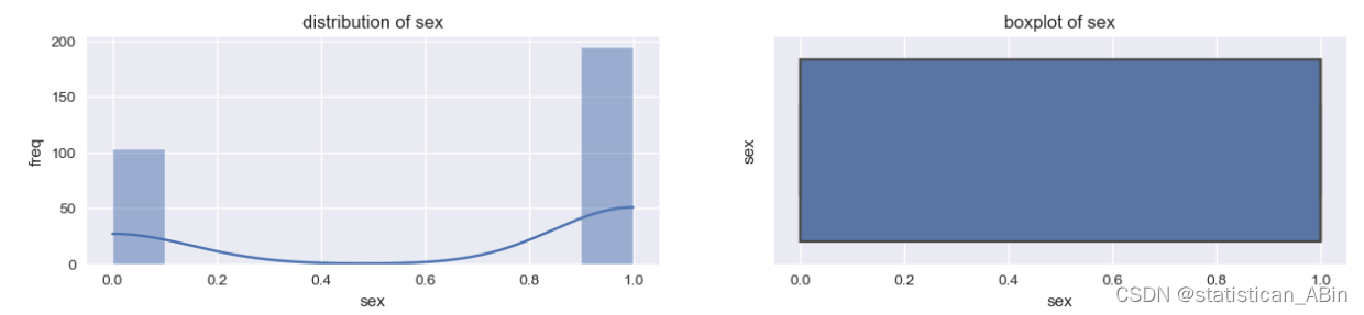
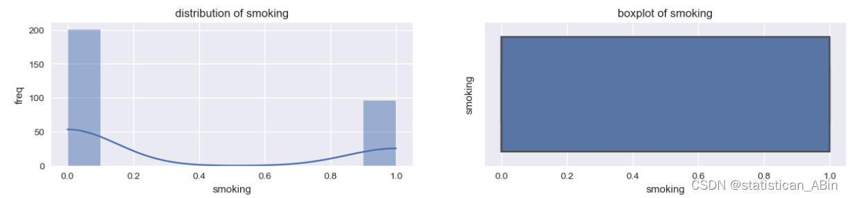
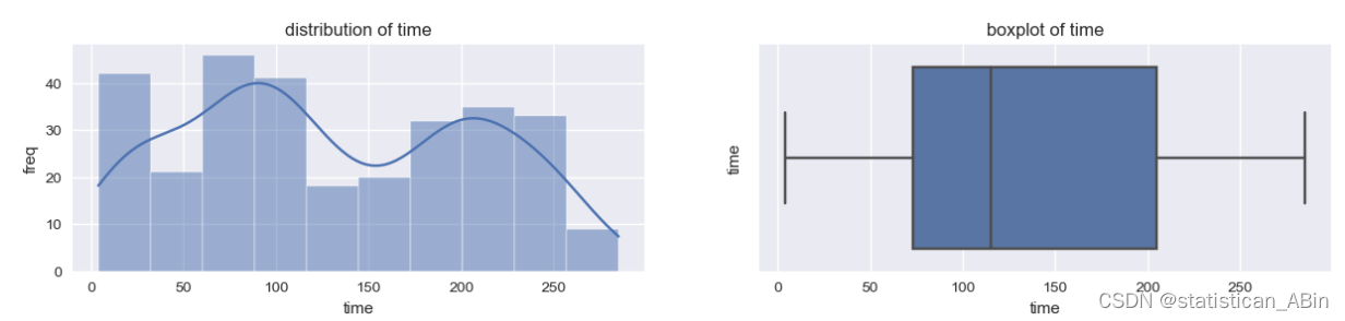
for column in df.columns:if df[column].dtype!="object":plt.figure(figsize=(15,6))plt.subplot(2,2,1)sns.histplot(data=df,x=column,kde=True)plt.ylabel("freq")plt.xlabel(column)plt.title(f"distribution of {column}")plt.subplot(2,2,2)sns.boxplot(data=df,x=column)plt.ylabel(column)plt.title(f"boxplot of {column}")plt.show() 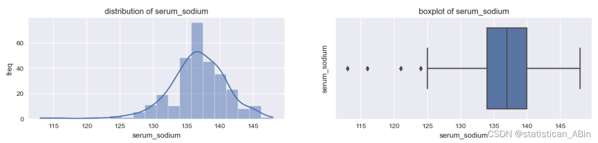
 接下来进行机器学习预测,划分训练集和测试集
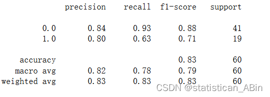
逻辑回归
from sklearn.preprocessing import MinMaxScalerscaler = MinMaxScaler()x = scaler.fit_transform(x)
y = scaler.fit_transform(y.values.reshape(-1,1))
model = LogisticRegression()
model.fit(x_train, y_train)
y_pred = model.predict(x_test)
print(classification_report(y_test,y_pred))
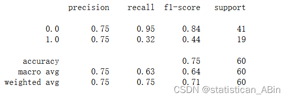
决策树
支持向量机
plt.rcParams['figure.figsize']=15,6
sns.set_style("darkgrid")
ax = sns.barplot(x=mylist2, y=mylist, palette = "rocket", saturation =1.5)
plt.xlabel("Classifier Models", fontsize = 20 )
plt.ylabel("% of Accuracy", fontsize = 20)
plt.title("Accuracy of different Classifier Models", fontsize = 20)
plt.xticks(fontsize = 12, horizontalalignment = 'center', rotation = 8)
plt.yticks(fontsize = 13)
for p in ax.patches:width, height = p.get_width(), p.get_height()x, y = p.get_xy() ax.annotate(f'{height:.2%}', (x + width/2, y + height*1.02), ha='center', fontsize = 'x-large')
plt.show() 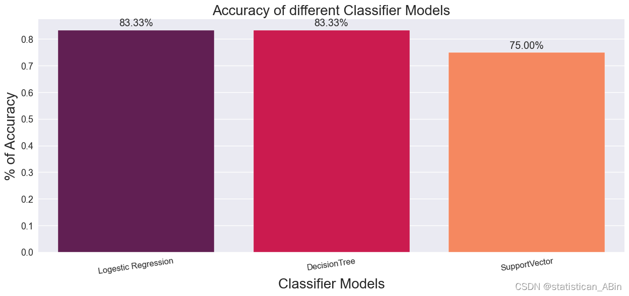
完整代码和数据
创作不易,希望大家多点赞关注评论!!!